Psychology Of Website Design: How To Use Visual Cues To Influence User Behavior
6 Mins Read
Published on: 10 April 2023
Last Updated on: 14 May 2024

toc impalement
The psychology of website design is a fascinating topic that often gets overlooked. But there’s a reason why we can use psychological principles to improve the user experience.
This post will cover some basic user psychology and how it applies to website design. Then we’ll dive into visual design, how it works, and why a website design company needs to pay attention to this aspect of their work.
Finally, we’ll also discuss how you can use these principles in your work! So sit back and relax. By the end of this article, you’ll have everything you need to know about how psychology plays into your next project.
User Psychology 101
User psychology is the study of how people think and behave. It’s a field that has been around for decades, with researchers studying everything from how we make decisions to what motivates us.
The goal of user psychology is to understand how people interact with websites, apps, and other digital products so that you can create a better user experience (UX). This will help you build more effective websites and apps that provide value for your customers or clients by meeting their needs in a way they can easily understand.
Here are some examples of UX design tactics based on user psychology:
- Create an effective site map. Knowing how people will use your site before you build it is important, so creating a site map is essential. This will help you identify any potential issues with navigation or usability.
- Create a user persona. This is a fictional representation of your target audience based on research and analysis. It can help you determine which content to include on your site and how to design it to appeal to your audience’s needs.
- Use user interviews or surveys. By talking with real people about their experiences with a product or service, you can gain valuable insights into what works well for them and where improvements might be needed.
- Use content testing. This is a form of user research in which you ask your target audience to read or view certain content and give their reactions and opinions about it.
- Use eye-tracking software. This technology allows you to see which parts of your site are most important to users by monitoring their eye movements. It can also help you determine where they click on a page and what they do when they get there.
What Is the User Experience?

The user experience (UX) is how a user interacts with a product or service. It encompasses the design of the product or service and the interaction between the user and that product or service.
UX design aims to create an experience that makes users feel in control while guiding them toward their desired outcome, whether purchasing something, learning something new, or solving an immediate problem.
What Is Visual Design?
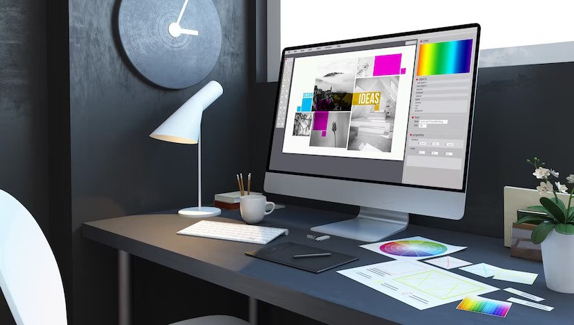
The visual design uses elements within a website or app to create an aesthetic and functional user experience.
The importance of visual design is often underestimated. People tend to think that what they see is just as important as what they read or hear.
This is especially true online, where visuals are often the only way to communicate something complex or abstract. When done well, visual design can help users understand information quickly and easily; when done poorly, it can make things confusing or even impossible to understand.
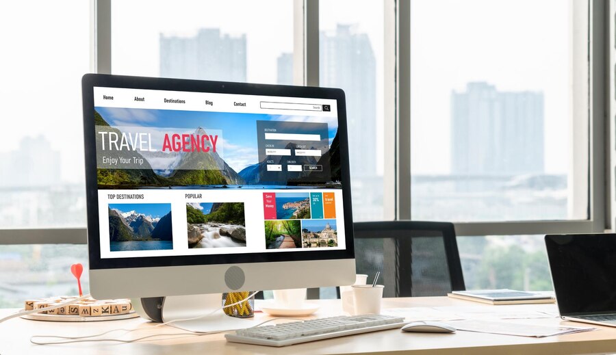
For a website to be successful, it needs to be both aesthetically pleasing and functionally sound. A website design company can use visual cues to create an engaging website that encourages users to interact with the website, understand its purpose, and ultimately achieve its goal.
Visual Cues in Website Design
You’ve probably heard the saying, “A picture is worth a thousand words.” This is especially true when it comes to website design.
Visual cues are used in every aspect of your website, from fonts and colors to layout and spacing. They can influence how users perceive your brand and even how they interact with the site itself.
Here are some common visual cues used in web design:
- Color: Color can be used as an indication of function or content type. It also helps guide users’ eyes through the page by contrasting text areas, images, and backgrounds.
- Font size: Smaller font sizes encourage readership because they allow more words per line; however, large fonts make it easier for people who have trouble seeing small print, such as seniors or those who wear glasses while browsing online.
- Font style: Using italics or bolding can emphasize words or phrases.
- Paragraph spacing: Short paragraphs give the appearance of a quicker read and allow users to see more content on one page. Longer sections with less space between them make it look like less information is available on that page.
- Layout: Using white space helps users focus on meaningful content and can make a site look more professional. Line breaks, paragraph spacing, and column width are all factors that affect the layout.
- Graphics: Graphics can break up the text, make things more interesting, or simply be used because they look good. However, some users find images distracting or hard to read, so designers should use them sparingly.
How to Use Visual Cues in Your Website Design to Influence Behavior

1. Use visual cues to emphasize your brand’s personality and values.
Visual cues can make a brand seem more relatable or even more professional. For example, if you want to convey a sense of professionalism, you can use a darker background and more muted colors.
If you want your brand to become more fun and playful, you could go for bolder colors and a lighter background, and maybe even add some animations or animated GIFs throughout the design.
2. Use visual cues to create a sense of urgency.
When you want to get your visitors to take action, you need to convince them that they’re running out of time. This is why countdown timers are so popular on e-commerce sites.
They don’t just tell your customers how much time is left in their shopping cart; they also give them a visual cue that says, “If you don’t buy this now, someone else will.”
3. Use visual cues to encourage social sharing.
Visual cues can help encourage visitors to share your content on social media. This can be done in various ways, such as using a Facebook-style “Like” button or adding a tag to the bottom of each page that encourages users to share their experiences with friends and family.
4. Use visual cues to help visitors understand the value of your product or service.
If you’re trying to sell something, it’s important to let people know how valuable your product is. You can do this with visual cues that show the value of your product or service, such as how it will look on a person or how much space it takes up.
A common way to do this is by using a photo of an object next to the thing itself. This helps visitors understand the size and shape of the item they’re purchasing, which makes them feel more confident about their purchase.
Employ a Web Design Company for Visuals
Using visuals in web design has long been proven to increase user engagement. If you’re looking to improve your business, there’s no better way than by enlisting the help of a web design company.
A good web design company will be able to create a website that looks appealing and works well for today’s customers.
They know what colors, fonts, and images are popular online and can incorporate them into your site. They also have experience creating websites that convert visitors into paying customers.
If you need help figuring out where to start when it comes time to redesign your website, hiring a professional is the way to go!
Key Takeaways
Your website is a big part of your business, and how it looks can significantly impact how people perceive your brand.
Visual cues are one of the most powerful tools in your arsenal when designing a site that will help generate conversions. When used correctly, they can help you connect with your audience emotionally and give them a reason to stay on your site longer, which means more opportunities for sales!
So use visual cues wisely and ensure you include them in your marketing materials. Your customers will thank you for it!
Read Also:


Comments Are Closed For This Article