How to Develop Harmonious Color Schemes: Creating Visual Balance And Cohesion
6 Mins Read
Published on: 18 July 2023
Last Updated on: 20 November 2024

toc impalement
Colors can have a powerful impact on your emotions and perceptions and play a vital role in the design world.
Understanding how to develop harmonious color schemes is essential for creating visually captivating and cohesive spaces. Whether undertaking a home renovation project or considering a career in interior design, mastering the art of color selection is crucial.
This article will explore the process of developing harmonious color schemes, providing insights and practical tips for creating visually appealing designs that evoke the desired mood and style.
What Is Color Harmony?

Understanding the principles behind color harmony can enhance your ability to create stunning and balanced spaces. You can join interior design courses to gain more knowledge and understanding of color harmony.
However, if you want something on the fly, then this section is perfect for you. Here, we will be briskly touching on the topic of Color Harmony. In simplicity, color harmony is a set of rules that produce visually appealing color schemes.
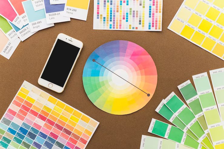
You can find color harmony with the help of geometric shapes on the wheel. Select one color and create a gradient. This will enable you to find the right color harmony. However, for a better understanding of hues, you also need to understand the color theory, so follow along.
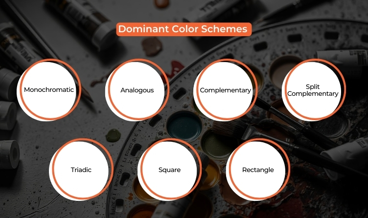
Dominant Color Schemes

Since we are already on the topic of hues and their usage, we believe that it is important that we take a look at some of the most dominant color schemes that one needs to follow.
In this section, we will be looking at some of the most dominant color schemes that you need to follow. Here we go!
- Monochromatic: This color scheme is also known as the black-and-white color scheme. This is one of the most used color schemes. However, this color scheme lacks contrast
- Analogous: An analogous color scheme is formed by pairing one primary color with two secondary colors.
- Complementary: This is based on two directly opposite colors on the color wheel. This creates a sense of semblance and parody at the same time.
- Split Complementary: Split is somewhat similar to triadic but with one dominant color. One dominant color scheme is used, while two adjacent colors are used to complement the dominant hue.
- Triadic: A Triadic color scheme is when a combination of three equally dominant hues is used.
- Square: The square color scheme uses the four equidistant colors on the color wheel to build a color palette. These colors need to be equally spaced from each other.
- Rectangle: The rectangle also operates similarly to the square. However, the combination is more subtle and follows a square-like shape.
Understanding Color Theory:
Before developing harmonious color schemes, it’s vital to grasp the fundamentals of color theory. Color theory encompasses the color wheel, which consists of primary, secondary, and tertiary colors, serving as the basis for color combinations.
Understanding the principles of color relationships, such as complementary, analogous, and triadic, provides valuable insights into how colors interact and harmonize. This knowledge forms the foundation for creating visually appealing and balanced color schemes.
In developing harmonious color schemes, it’s essential to understand the psychological effects of colors on human perception. Different colors evoke specific emotions and moods, influencing our perception of space.
Red and orange generate a warm and dynamic ambiance, while blue and green produce a calming and relaxing effect. By understanding the psychological impact of colors, designers can intentionally choose colors that align with a space’s desired mood and style.
Identifying the Dominant Color:
Identifying the dominant color is the first step in developing a harmonious color scheme. This color sets the overall tone and serves as the anchor for the rest of the scheme.
When selecting the dominant color, it’s essential to consider its interaction with natural and artificial lighting. Lighting can significantly affect how colors appear in space. Natural light brings out the most accurate hues of colors, while artificial light sources, such as incandescent or fluorescent bulbs, may cast different color tones.
Testing colors under other lighting conditions is essential to achieve the desired effect. Designers can also consider using lighting techniques, such as accent lighting or adjustable fixtures, to enhance the visibility and vibrancy of the dominant color.
Choosing Complementary Colors:
Complementary colors are hues opposite each other on the color wheel. Incorporating complementary colors in a color scheme adds a dynamic contrast and visual interest.
These contrasting colors create a vibrant interplay and add depth to the overall design. Carefully integrating complementary colors ensures a visually engaging and harmonious color scheme.
Exploring Analogous Colors for Creating Cohesion and Flow
Analogous colors are hues that sit next to each other on the color wheel and have a similar undertone. Incorporating analogous colors in a color scheme creates a sense of cohesion and flow.
Analogous colors bring a sense of harmony and visual unity, making the design feel cohesive and well-integrated. The skillful use of similar colors enhances the overall aesthetic appeal of the color scheme.
When working with analogous colors, designers can explore different shades, tints, and tones within the same color family. This variation adds depth and interest to the scheme. It’s also important to consider the value contrast between the colors. Value refers to the lightness or darkness of a color.
By incorporating analogous colors with varying values, designers can create a visual hierarchy and depth within the space. For example, using a darker shade of the dominant color as an accent can draw attention to specific areas and add dimension to the design.
Enhancing Visual Interest
Accent colors contrast and draw attention to specific areas or elements within a space. Carefully choosing accent colors complementing the dominant color and the overall scheme ensures a harmonious integration.
Accent colors can be more vibrant and bolder, creating a striking contrast against the more subdued tones of the dominant and supporting colors. The strategic use of accent colors elevates the design and adds focal points that capture attention.
When incorporating accent colors, it’s essential to consider their placement and proportion within the space. Accents can be introduced through artwork, decorative accessories, or small areas of intense color. These accents should be strategically placed to create balance and visual interest.
Considering Tints, Shades, and Neutrals: Creating Depth and Balance
In addition to the primary colors in the color scheme, it’s essential to consider the use of tints, shades, and neutrals. Tints are created by adding white to the color, resulting in lighter and softer variations. Meanwhile, shades include black.
Neutrals, such as whites, greys, and beiges, provide a calming and balanced backdrop for the other colors in the scheme. Incorporating tints, shades, and neutrals adds depth and balance to the overall design, enhancing the visual impact of the color scheme.
Experimenting and Refining:
Developing a harmonious color scheme is a process that requires experimentation and refinement. You can experiment once the initial color scheme is established. There will certainly be some space for experimenting with things in some way.
Lighting conditions, natural surroundings, and other elements can influence how colors appear in a room. Designers should evaluate the scheme under different lighting conditions, at different times of the day, and with different materials and finishes present.
Conclusion:
Developing harmonious color schemes is a fundamental skill for interior designers and enthusiasts alike.
You can create visually captivating and cohesive designs that transform spaces by understanding color theory, identifying dominant colors, choosing complementary and analogous hues, incorporating accent colors, and considering tints, shades, and neutrals.
The art of color selection is a powerful tool that can alter perceptions, evoke emotions, and create the intended style in any interior design project.
Whether embarking on a home renovation or pursuing interior design courses, mastering the art of developing harmonious color schemes will elevate your design skills and enable you to create visually stunning and impactful spaces.
So, embrace the world of color and unleash your creativity to bring harmony and beauty into every space you design.
Read Also:


Comments Are Closed For This Article