How to Create a Kagi Chart in Excel?
3 Mins Read
Published on: 26 May 2022
Last Updated on: 14 November 2024

toc impalement
Kagi charts are a type of financial chart used to measure price movements and trends. It is similar to a candlestick chart, but it uses lines instead of bars to represent the data.
The lines are drawn so that they always slope in the same direction, up if the price is increasing and down if the price is decreasing. They are popular among traders and investors because they are easy to interpret and can be used to identify both short-term and long-term trends.
Creating a Kagi chart in Excel is a straightforward process that can be completed in just a few steps.
Now that you know what is a Kagi chart, learn how to create one in Excel below.
Make Kagi Chart in 4 Easy Steps:
1. Begin by creating two columns

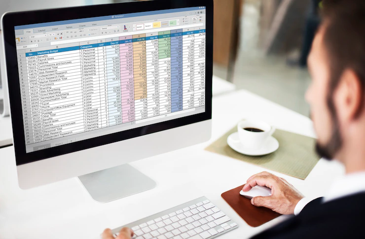
Creating a Kagi chart in Excel can be a little tricky, but with a few simple steps, you can have one up and running in no time. First, you’ll need to create two columns in your spreadsheet. In the first column, list the prices of the stocks you’re monitoring. In the second column, list the dates of when those prices were recorded.
2. Select the data and select the chart type

Once you have your data in place, you can start creating the Kagi chart. Begin by selecting the data in the first column, and then go to the Insert tab and select the Line chart type.
Excel will create a basic line chart, but you’ll need to change a few settings to make it look like a Kagi chart.
Keep in mind that while there are plenty of different chart types, a Kagi chart is easy to understand. Plus, it’s versatile and adaptable depending on the data you’ve collected. With this chart, it’s a lot easier to monitor price action.
3. Change the chart options to create the Kagi chart

You will need to right-click on the chart and select the Select Data option. In the Edit Series window, change the Series Name to “Price” and click the Add button.
Then, select the data in the second column and add it as a new series, naming it “Date”. Next, click on the Chart Options button in the upper right-hand corner of the chart.
In the Format Axis pane, change the Minimum and Maximum values to “0” and “1,” respectively. This will ensure that the chart only includes data from the first to the last day in your data set.
4. Select the appropriate colors for each series

Finally, select the Price series and change the Line Color to green and the Line Width to 2. Then, select the Date series and change the Line Color to red.
If you want, you can also add labels to the axes. As you can see, the Kagi chart clearly illustrates the price movements for each stock over time. It can be a great tool for tracking the performance of your investments.
Creating a Kagi chart in Excel is a very efficient way to track stock prices and changes. The Kagi chart can be customized to fit the needs of the user. For example, the user can choose the time frame for the chart, the price scale, and the indicator settings.
It is also a visual way to see the trend of the stock prices and make decisions about whether to buy or sell. When used in combination with other technical indicators, it can provide a more accurate reading of the security’s price movement.
They can be used to generate buy and sell signals, and to help identify support and resistance levels. Kagi charts can also be used to determine the strength or weakness of a trend.
Related Resource:
Why HR Technology Is A Worthy Investment For A Business


Comments Are Closed For This Article